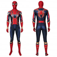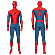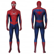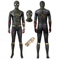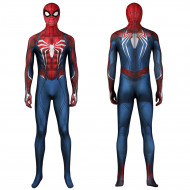
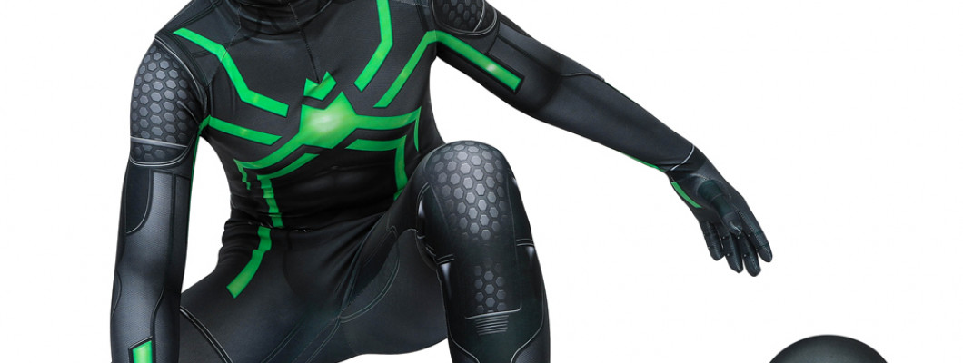
A Spider-Man costume can have detailed printing, textured fabric, and dozens of carefully reproduced design elements and still look unconvincing once someone puts it on.
The reason is simple: realism starts with the large shapes people notice immediately. The mask, eye proportions, body silhouette, chest emblem, and color blocking establish the character long before anyone sees the texture of the fabric.
That means the most realistic-looking Spider-Man costume is not necessarily the one with the most detail. It is the one where the important details work together at the right scale.
The Mask Usually Determines Whether the Costume Works
Spider-Man's mask carries more visual weight than almost any other part of the costume.
There is no exposed face, helmet, hair, or facial expression competing for attention. The lenses effectively become the character's eyes, while the shape of the fabric establishes the outline of the head.
This is why a wrinkled mask can undermine an otherwise impressive suit so quickly.
Loose fabric around the nose, cheeks, jaw, or chin breaks the clean shape associated with Spider-Man. Instead of seeing one smooth masked head, the viewer starts noticing the contours of the face underneath.
A more structured mask keeps those facial details from dominating the silhouette.
A faceshell is one way to achieve that effect. It sits beneath the fabric and creates a more consistent head shape while helping keep the mask surface taut. It is not automatically necessary for every costume, but the visual principle matters whether a faceshell is used or not: the mask should read as a deliberate shape rather than loose fabric stretched over a face.
The lenses matter just as much.
Their width, height, angle, spacing, and border thickness all change the expression of the mask. Large white lenses can create a very different appearance from narrow angular ones, even if everything below the neck is identical.
The goal is not simply to find the biggest or most dramatic lenses. Their proportions need to match the Spider-Man version the costume is trying to represent.
A Good Fit Preserves the Design Instead of Just Making the Suit Tight
Spider-Man costumes are supposed to fit close to the body, but "tighter" is not the same thing as "more realistic."
The important issue is whether the suit keeps its intended proportions when worn.
If the costume is too loose, folds can interrupt:
web patterns,
color boundaries,
chest graphics,
muscle shading,
side panels.
If it stretches too aggressively, the opposite problem appears. A spider emblem can become wider than intended, circular web patterns can turn oval, and printed panel lines can shift away from where they are supposed to sit.
This matters especially around the chest, shoulders, waist, and mask because these areas contain some of Spider-Man's most recognizable design landmarks.
The costume does not need to erase every natural fold created by movement. It does need to avoid looking permanently distorted before the wearer has even changed pose.
Eye Shape and the Chest Emblem Matter More Than Tiny Surface Texture
Not every costume detail has equal visual importance.
The eye lenses and chest spider are among the most visually prominent elements used to identify a particular Spider-Man design.
The eyes dominate the mask. The chest emblem anchors the torso.
A chest spider that sits too high can make the upper torso look compressed. An emblem that is unusually wide can make the chest appear broader. A long, narrow emblem can create a stronger vertical line down the torso.
The same principle applies to the lenses.
Their proportions affect how wide or narrow the head appears and whether the mask seems expressive, aggressive, neutral, or exaggerated.
A costume may reproduce hundreds of tiny hexagons, dots, or printed fibers accurately, but if the lenses are badly shaped, most people will notice the lenses first.
Webbing and Texture Need Enough Contrast to Be Seen
Web patterns are one of Spider-Man's defining design features, but their effectiveness depends on more than whether they are printed or raised.
What matters visually is how clearly they separate from the rest of the suit.
Low-contrast web lines can disappear from several feet away. Darker or more dimensional webbing tends to remain easier to read because it creates a stronger edge against the underlying color.
Raised detailing can also create small shadows, making the pattern more noticeable under directional lighting.
That does not mean raised webbing is automatically more realistic.
Some Spider-Man designs are supposed to look relatively flat and graphic. Others use visibly textured or dimensional web patterns. Adding heavy three-dimensional webbing to a version that was designed with subtler lines can make the costume less accurate rather than more.
Texture works the same way. A subtle surface pattern may look impressive in a close portrait but become almost invisible from across a room. It should be treated as a finishing layer rather than the foundation of the costume's visual accuracy.
Color and Contrast Shape the Whole Costume
People often discuss Spider-Man colors as if the goal were finding one universally correct shade of red or blue.
There is no single answer because different Spider-Man designs use different palettes.
Some use bright primary colors. Others use darker reds, deep navy, black, or muted tones.
What matters more is the relationship between those colors.
The red sections should separate clearly from the blue or black sections. The web pattern should remain visible against the red. Lens borders need enough contrast to define the eyes. The chest emblem needs to remain legible instead of blending into the surrounding print.
Weak contrast can make a detailed suit look muddy from a distance. Source-appropriate contrast keeps the major design shapes readable without pushing the costume away from the version it is meant to represent.
Realistic Does Not Mean Adding the Most Detail Possible
One of the easiest ways to make a Spider-Man costume less convincing is to combine individually impressive details that do not belong together.
Large reflective lenses, thick raised webbing, a heavily textured surface, and a dramatic chest emblem may all look elaborate. That does not mean they belong on the same Spider-Man design.
Different versions rely on different visual languages.
A comic-inspired suit may intentionally use clean surfaces and simple graphics. A movie suit may depend heavily on surface texture and dimensional webbing. A game design may introduce unusual paneling or emblem proportions that would look incorrect on a classic suit.
The mask should look like it belongs with the torso. The emblem should match the same source as the lenses. The web pattern should follow the design language used by the rest of the costume.
More detail only helps when it is the right detail.
What Matters From Ten Feet Away vs. in a Close-Up
A useful way to judge a Spider-Man costume is to stop looking at every feature from the same distance.
Different details become important at different scales.
| Viewing distance | What stands out most |
|---|---|
| Across a room | Silhouette, color blocking, eye shape, chest emblem |
| Conversation distance | Mask shape, web pattern, panel alignment |
| Portrait distance | Wrinkles, lens edges, seams, surface texture |
| Extreme close-up | Fine printing, fabric pattern, dimensional finishing |
This explains why some costumes look excellent in product close-ups but less convincing in full-body photos.
A highly detailed fabric texture may dominate a close crop. Move back several feet and that texture largely disappears. The viewer is left with the mask, colors, emblem, and silhouette.
For conventions, stage appearances, and full-body photography, those larger elements matter first because people often see the complete costume before they get close enough to inspect its surface.
How to Judge a Spider-Man Costume Before Buying It
Product photos become more useful once you know where to look.
Start with images showing the costume being worn rather than relying entirely on flat-lay photos or extreme close-ups.
Then evaluate it in roughly this order:
Look at the mask from the front and side. Check whether the head shape stays smooth and whether the lenses sit naturally within it.
Check the chest emblem. Make sure its size and placement still look intentional on a person rather than distorted by the suit.
Follow the web and panel lines. Look for abrupt stretching, twisting, or misalignment.
Check for persistent bunching. Natural movement creates folds, but major loose areas should not dominate the design.
Compare the colors and contrast with the intended Spider-Man version.
Only then examine fine texture and dimensional details.
That order prevents an impressive close-up texture from distracting from much larger proportion problems.
If you are comparing different designs, the Spider-Man costumes category provides multiple versions that can be evaluated using the same visual criteria.
The Details That Usually Give a Spider-Man Costume Away
The most noticeable problems are usually structural rather than microscopic:
a mask that collapses around the nose or jaw,
lenses that are badly proportioned or positioned for the intended version,
a chest emblem distorted by stretching,
web or panel lines that twist out of alignment,
permanent loose folds,
details borrowed from incompatible Spider-Man designs.
A realistic Spider-Man costume works from the outside in. The mask shape, silhouette, proportions, emblem, and contrast need to work first. Texture, raised detailing, and fine printing should strengthen those foundations rather than try to compensate for them.