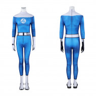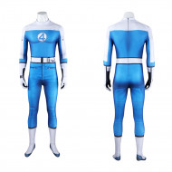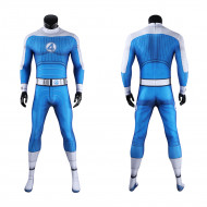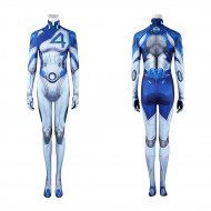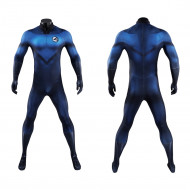
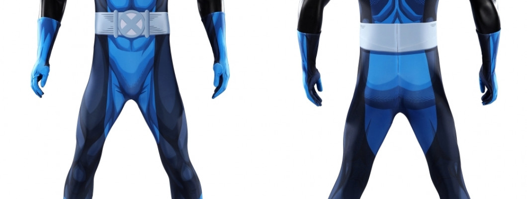
Two Fantastic Four costumes can both be blue, carry the familiar "4" emblem, and still represent completely different versions of the team. The easiest way to tell them apart is not by hunting for tiny seam details. Start with the trim color, shoulders, chest emblem, and overall level of technical detailing.
The original comic uniforms established a simple blue team look. Later comics introduced much stronger white contrast. The 2005 movie darkened and streamlined the design, the 2015 reboot moved toward functional containment gear, and The Fantastic Four: First Steps brought the team back to a brighter retro-futurist uniform.
Those differences matter when buying a Fantastic Four costume because each version creates a noticeably different impression when worn.
Fantastic Four Costume Versions at a Glance
| Costume version | Fastest way to recognize it | Overall look |
|---|---|---|
| Classic comic | Blue body with dark trim and round "4" emblem | Clean, traditional superhero uniform |
| Blue-and-white comic era | Strong white gloves, boots, collar, or shoulder contrast | Graphic and high-contrast |
| 2005/2007 movies | Dark blue with black detailing and a smaller badge | Sleek, understated live-action style |
| 2015 reboot | Straps, panels, restraints, and functional-looking construction | Technical and utilitarian |
| First Steps | Bright blue, broad white areas, centered circular emblem | Retro-futurist team uniform |
| Future Foundation | Black and white instead of traditional blue | Deliberately different from classic FF |
The Classic Blue Uniform Established the Fantastic Four Look
The Fantastic Four did not originally appear in superhero costumes in their first comic issue. Their recognizable team uniforms arrived in Fantastic Four #3, establishing the basic visual language that later versions would repeatedly revisit: blue clothing, contrasting trim, and the circular Fantastic Four emblem. Marvel describes the simple blue uniform as the team's original classic look.
What makes the classic version work is its simplicity. There are no large armor panels or complicated surface graphics competing with the chest symbol. The blue body creates one continuous field, while darker gloves, boots, collar details, and waist treatment frame the figure without breaking it into too many sections.
The result is a very traditional comic-book silhouette. From a distance, the costume reads as blue superhero suit first, Fantastic Four uniform second, with the round emblem providing the identity.
It is also one of the easiest styles to recognize across different interpretations. Exact shades and proportions change from artist to artist, but a relatively plain blue uniform with dark contrast immediately points toward the team's older comic design language.
For someone who wants a Fantastic Four costume without tying the look strongly to one movie adaptation, this is the safest visual direction.
Blue and White Makes the Uniform Much More Graphic
One of the most important comic redesigns replaced much of the darker trim with white. Marvel traces this blue-and-white change to Fantastic Four #256 during the team's Negative Zone adventures.
That may sound like a simple color swap, but it changes the appearance considerably. White gloves and boots stand out sharply against a dark blue body, while white around the collar or shoulders makes the upper torso appear broader and divides the costume into stronger geometric blocks.
Instead of one mostly continuous blue shape, the eye immediately notices the contrast between the blue center and white edges. This is why blue-and-white Fantastic Four costumes tend to be easier to read at a distance than darker versions: the gloves, boots, shoulders, and emblem remain visible even when smaller details disappear.
The contrast also pushes the costume toward a more obviously designed team uniform. Reed, Sue, and Johnny look visually connected before you even focus on their faces or powers.
Later Fantastic Four designs have returned to blue and white repeatedly, so color alone does not identify one precise comic issue or adaptation. It is better to treat blue-and-white as a visual family and then examine the shoulders, emblem, belt, and fabric treatment to narrow down the version.
The 2005 Movie Made the Fantastic Four Look Darker and More Cinematic
The 2005 Fantastic Four movie kept enough blue to preserve the team's identity but moved away from the brighter simplicity of the comics.
The movie uniforms use darker blue combined with black sections and a more restrained chest insignia. Rather than making the circular "4" the dominant feature in the middle of a bright torso, the design integrates the logo into a darker, more streamlined overall suit.
A classic comic uniform relies on broad blocks of color. The 2005 approach depends more on shaping and contrast between dark materials. The body looks longer and less segmented because there are fewer bright areas interrupting the torso and limbs.
The film also gives the uniforms a functional connection to the team's powers. Their space-mission suits are made from self-regulating "unstable molecules," and after exposure to the cosmic storm, the material adapts along with the characters' transformed bodies and abilities.
For costume buyers, though, the important difference is simpler: the 2005 look is Fantastic Four without looking especially bright or retro.
It works best for someone who prefers early-2000s superhero movie styling over a direct comic-book appearance. In a group cosplay, the shared dark blue still creates team consistency, but the effect is noticeably more subdued than the brighter comic and First Steps designs.
The 2015 Suits Look Like Equipment Before They Look Like Superhero Costumes
The 2015 reboot takes the largest visual departure among the main live-action versions.
Instead of beginning with the familiar blue Fantastic Four uniform and modernizing it, the movie treats the human characters' clothing more like equipment designed around their altered bodies. Reed, Sue, and Johnny wear designs with containment, stabilization, or functional elements adapted to their powers, while Ben Grimm is the obvious exception because his transformed rocky body becomes the dominant visual feature.
Traditional Fantastic Four costumes depend on clean color blocking and a recognizable team emblem. The 2015 designs emphasize straps, segmented construction, restraints, reinforced areas, and equipment-like detailing.
As a result, the eye notices the hardware and structure before the Fantastic Four identity, giving the suits an industrial, experimental appearance rather than the polished unity normally associated with Marvel's First Family.
For cosplay, this version makes sense mainly if the 2015 movie itself is the target. It is not the strongest choice for someone simply looking for a recognizable Fantastic Four costume because many of the visual cues people associate with the team are deliberately reduced.
Put the classic uniform and the 2015 designs beside each other and they almost represent opposite approaches. The classic design communicates that four people belong to the same superhero team; the 2015 version emphasizes what happened to each individual and the equipment built around those consequences.
First Steps Turns the Uniform Into Retro-Futurism
The Fantastic Four: First Steps returns to a much more recognizable team-uniform concept, but it does not simply copy an older comic design.
Its most obvious features are the bright blue body, large white sections around the upper body and extremities, and prominent circular "4" emblem. Compared with the 2005 movie, the colors are lighter and the contrast is much stronger.
The surface treatment is also important. Costume designer Alexandra Byrne drew from 1960s science fiction and period skiwear rather than using the heavily printed technical surfaces common in modern superhero costumes. The suits incorporate ribbed and knitted elements to support the movie's retro-futurist setting.
A typical modern superhero suit often tries to suggest armor, synthetic technology, or layered engineered materials. The First Steps uniform has a softer visual rhythm because the ribbing runs through large sections rather than covering the body in tiny mechanical patterns.
From farther away, however, that texture matters less than the broad blue-and-white color blocking. This makes First Steps one of the clearest group-cosplay versions of the Fantastic Four. Reed, Sue, Johnny, and Ben share an unmistakable uniform identity, and the white areas around the upper body make the team particularly easy to recognize in photographs or across a convention space.
The overall effect sits somewhere between vintage sportswear, space-program clothing, and a traditional comic superhero costume. It is retro without looking like an exact recreation of a 1960s comic panel.
The Thing Changes the Comparison
Ben Grimm requires slightly different thinking from the other three members.
Reed, Sue, and Johnny can all be compared largely through full-body uniform design. Ben's rocky body is already such a dominant visual feature that different adaptations vary in how much conventional Fantastic Four clothing they give him.
Some versions leave far more of the rocky form exposed. Others emphasize his membership in the group through larger areas of shared team clothing. When identifying a Thing costume, the useful question is therefore not simply, "What shade of blue is this?" Look at how much of the Fantastic Four uniform is actually present.
A Ben Grimm design with substantial bright blue-and-white team clothing creates a very different silhouette from versions built mostly around exposed orange rock.
The current XheroSuits First Steps Ben Grimm jumpsuit, for example, uses the coordinated bright blue-and-white team layout with the circular emblem centered on the upper torso. XheroSuits specifically identifies that design with The Fantastic Four: First Steps.
That makes it most relevant to someone trying to assemble a coordinated First Steps group rather than someone seeking a mostly exposed-rock Thing appearance.
Future Foundation Breaks the Blue Fantastic Four Rule Completely
Not every important Fantastic Four costume is blue.
After the apparent death of Johnny Storm in the comics, the team adopted the Future Foundation identity and replaced its traditional Fantastic Four uniforms with black-and-white designs. Marvel describes the group as adopting new black-and-white costumes along with a different emblem system.
The palette creates an immediate visual break from the traditional team. Instead of a bright blue superhero uniform, the Future Foundation design relies on stark black-and-white contrast, so even before recognizing individual details it looks like a separate organization.
For cosplay, Future Foundation is a useful choice when someone wants something recognizable to knowledgeable Marvel fans without wearing another conventional blue Fantastic Four suit. It is also particularly effective for group costumes because repeating the black-and-white palette across several characters makes the shared identity obvious.
Other Alternate Colors: The Red Uniforms
The Fantastic Four have also worn red uniforms during periods when the comics deliberately moved away from the expected blue palette.
These versions are worth knowing because a red Fantastic Four costume can otherwise look almost like an unrelated alternate design to someone familiar only with the movies. The team emblem and shared uniform structure preserve the Fantastic Four identity, but replacing the familiar blue with red immediately makes the look feel less traditional.
For most buyers seeking the classic Fantastic Four image, red is a secondary choice. Its appeal is mainly to readers who specifically want a less common comic-era appearance rather than the team's best-known visual identity.
Which Fantastic Four Costume Version Should You Choose?
The useful choice is not simply "comic or movie." Several of these versions occupy very different positions even within those categories.
Choose a classic blue-and-dark-trim design if you want the most traditional Fantastic Four appearance. The simple color blocking and circular emblem communicate the team without tying the costume strongly to one modern adaptation.
Choose a blue-and-white comic-inspired design if you want stronger contrast. White gloves, boots, collars, or shoulders remain visually clear from farther away and give a group costume a more coordinated appearance.
Choose the 2005 movie style if you prefer darker superhero suits. Its restrained blue-and-black palette feels more cinematic and less brightly comic-inspired.
Choose the 2015 version only if that specific reboot is the appeal. Its containment-equipment aesthetic deliberately moves away from the conventional Fantastic Four uniform and is the least immediately recognizable of the main movie designs.
Choose First Steps if you want the strongest retro team presentation. The bright blue, broad white sections, large emblem, and ribbed surface language make the uniform read clearly both individually and as part of a four-person group.
Choose Future Foundation if you specifically want to avoid traditional Fantastic Four blue. The black-and-white palette changes the identity immediately while still belonging to an important period in the team's comic history.
Once you know which visual family you want, comparing individual products becomes much easier. Instead of treating every blue jumpsuit with a "4" on the chest as interchangeable, check the shoulders, emblem position, trim color, and overall surface design first.
XheroSuits currently carries several Fantastic Four costume designs spanning bright blue-and-white team uniforms, darker navy treatments, and more technical interpretations.
Browse Fantastic Four costumes at XheroSuits
Those four details usually tell you more about the version than a long product title does.