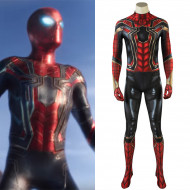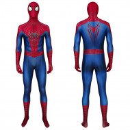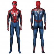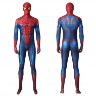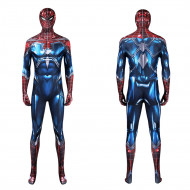
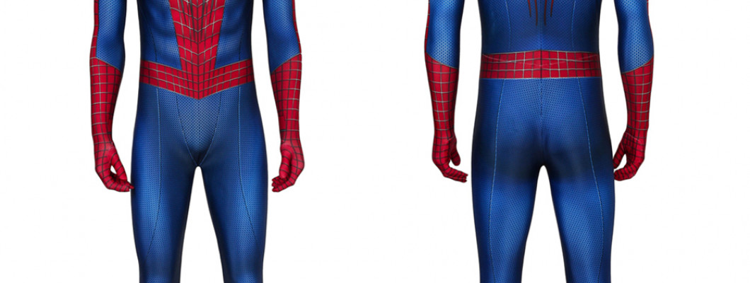
The Amazing Spider-Man 2 suit has the strongest overall look in real life. Its large white eye lenses, clear red-and-blue color blocking, long chest spider, and relatively clean surface design remain easy to read even without movie lighting or digital effects.
The Raimi suit can look more dramatic when its raised webbing and sculpted details are reproduced well, while a classic red-and-blue Spider-Man design has an advantage of its own: simplicity. It takes very little visual information for people to recognize it immediately.
That distinction matters for cosplay. A suit can look impressive in a movie close-up but lose much of its character once it is worn under ordinary lighting and viewed from across a convention hall.
What Makes a Spider-Man Suit Look Good on a Real Person?
Spider-Man costumes are unusually sensitive to small design changes because most versions share the same basic shape: a fitted full-body suit and mask.
There is no cape, armor, helmet, or large accessory to dominate the silhouette. The eyes, web pattern, chest spider, and placement of the red and blue areas have to do most of the visual work.
A design tends to translate well into real life when several things happen at once:
The eyes remain obvious from more than a few feet away.
The red and blue areas form clear shapes instead of blending together.
The web pattern is visible without overwhelming the suit.
The chest emblem is large enough to affect the appearance of the torso.
The costume still looks distinctly Spider-Man while the wearer is simply standing upright.
A deep crouch with dramatic lighting can make almost any Spider-Man costume photograph well. Standing normally is less forgiving.
TASM 2 Has the Strongest Real-World Balance
Andrew Garfield's second Spider-Man suit gets several important visual decisions right at the same time.
The large white lenses are the first advantage. They occupy enough of the mask to remain visible in full-body photographs and from farther away. Because the lenses are surrounded by comparatively thin dark borders, the face does not become overly crowded.
That eye shape also gives the mask much of its personality. Smaller lenses can create a sharper or more aggressive expression, but TASM 2's larger eyes produce a cleaner Spider-Man silhouette before the viewer has even noticed the rest of the costume.
The color arrangement helps just as much. The bright red areas remain clearly separated from the blue sections across the torso and limbs. From a distance, those broad color blocks matter more than tiny texture details because they define the overall body shape.
The chest spider reinforces that effect. TASM 2 uses a long, narrow front emblem with legs extending vertically across the torso. That visually pulls the eye up and down rather than across the chest, reinforcing a leaner appearance. Even when the viewer cannot make out every web line, the emblem still contributes to the suit's proportions.
The web pattern is restrained enough that it supports the red areas rather than becoming the dominant feature.
Taken together, those choices explain why the design works so well outside the movie. Its identity does not depend on one tiny detail being reproduced perfectly.
For anyone who has already settled on this version, XheroSuits lists a The Amazing Spider-Man 2 Peter Parker 3D Zentai Jumpsuit that includes the jumpsuit and mask. The visual case for TASM 2 does not depend on that specific product, but it provides a natural reference point for readers shopping for the same design.
The Raimi Suit Looks More Sculpted, but It Is Harder to Simplify
The Tobey Maguire-era suit approaches Spider-Man from almost the opposite direction.
Its most recognizable feature is the prominent raised silver webbing. Instead of allowing the web pattern to sit quietly within the red panels, the Raimi design turns it into a major part of the costume's surface.
That creates a stronger sense of depth. The suit feels more sculpted and substantial, especially around the chest, shoulders, and mask.
The eyes reinforce that impression. They are narrower and sharper than TASM 2's large lenses, giving the face a more serious expression. Combined with the dense web pattern, they make the entire costume feel visually heavier.
In a well-executed recreation, this is extremely effective. The Raimi suit is recognizable almost immediately.
The tradeoff is that more of its identity depends on dimensional details. If the raised webbing is flattened into an understated printed line, the design loses some of the quality that makes the movie costume distinctive in the first place.
That makes the Raimi suit an excellent real-world choice when the goal is a cinematic, sculpted appearance, but it is less forgiving of simplification than TASM 2.
A Classic Red-and-Blue Suit Often Looks Better Than a More Complicated One
Spider-Man does not actually need much decoration to look like Spider-Man.
A strong classic design needs only a few recognizable elements:
a red mask
clear white eyes
red-and-blue body panels
a black web pattern
a visible spider emblem
Because those components are so familiar, a simple classic suit can remain remarkably effective in real-world settings.
The large red and blue areas create immediate separation between the torso, arms, and legs. The viewer does not have to notice secondary panel lines or small technical accents to understand what they are seeing.
That becomes particularly useful at conventions and in full-body photography, where fine costume details often occupy only a few pixels in the finished image.
Simple does not automatically mean better, but complexity has to earn its place. Additional seams, metallic accents, tiny texture changes, and narrow panel divisions may look impressive in a close promotional image while contributing very little from fifteen feet away.
Some MCU Spider-Man Suits Favor Close-Up Detail
The Homecoming-era Stark suit is a useful example of how MCU Spider-Man designs can prioritize close-up detail over simple distance readability.
It keeps the familiar red-and-blue foundation but adds narrow black sections, more segmented panel divisions, and smaller technical details around the torso and limbs. Those additions help the costume feel more engineered than a traditional comic-style Spider-Man suit.
At close range, the extra structure gives the viewer more to notice. From farther away, however, the smaller divisions become less important than the larger red areas, darker sections, eye shape, and chest emblem.
That difference matters because the strongest feature of a costume can change with viewing distance. The Stark suit can reward closer photography without having the same immediate graphic simplicity as TASM 2 or a classic red-and-blue design.
That does not make it a poor cosplay choice. It simply favors a more technical, contemporary Spider-Man look rather than maximum visual clarity across a room.
The Mask Usually Decides the Look First
If one part of a Spider-Man costume deserves disproportionate attention, it is the mask.
People read faces automatically, even when the "face" consists of two white lenses.
Eye size changes the apparent proportions of the entire head. Large lenses occupy more visual space and can make the mask feel cleaner and more expressive. Narrow eyes leave more red material visible around them and usually create a sharper expression.
That is one reason the three major approaches feel so different:
TASM 2: Large lenses dominate the mask and remain visible at distance.
Raimi: Smaller, sharper eyes combine with prominent webbing to create a denser, more sculpted face.
Classic Spider-Man: Medium-to-large white eyes provide an immediately familiar comic-book appearance without requiring much additional detail.
A costume with excellent torso artwork can still feel slightly wrong if the mask proportions are off. The viewer usually sees the eyes before inspecting the chest spider.
Which Spider-Man Suit Looks Best for Different Styles?
| What you want | Best direction | Why it works |
|---|---|---|
| Best overall real-life appearance | TASM 2 | Large lenses, clean proportions, and strong color separation remain readable at different distances |
| Most cinematic and sculpted | Raimi suit | Prominent webbing and sharper eyes give the costume more surface depth |
| Most universally recognizable | Classic red and blue | Large graphic shapes communicate Spider-Man immediately |
| More modern and technical | MCU-inspired design | Added paneling and details create a contemporary movie-costume look |
For most people choosing primarily on appearance, TASM 2 is the safest overall pick. The design has enough detail to feel specific rather than generic, but its most important features are large enough to remain visible on an actual wearer.
The Raimi suit makes a stronger statement when its distinctive dimensional webbing is reproduced convincingly. Classic red and blue is harder to beat for straightforward recognizability.
Readers still deciding between versions can browse the broader Spider-Man costume collection, but the visual principle stays the same: the Spider-Man suits that look best in real life are usually the ones whose eyes, emblem, color blocking, and silhouette remain clear after all the cinematic advantages disappear.